Form fields
Text fields, checkboxes, radio buttons, selects and lists that can be filled in any PDF viewer.
Import them from @inkoxide/render. Examples, and how these components work together, are in the guide.
TextField
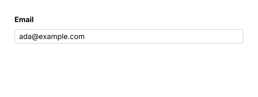
A text field.
import { Document, Page, Text, TextField, View } from '@inkoxide/render';

export default function Example() {
  return (
    <Document>
      <Page size={[320, 120]} className="p-6 text-xs">
        <View className="gap-2">
          <Text className="font-bold">Email</Text>
          <TextField name="email" value="[email protected]" className="h-6 w-full rounded border border-gray-300 px-1" />
        </View>
      </Page>
    </Document>
  );
}
| Prop | Type | Description |
|---|---|---|
value | string | |
multiline | boolean | |
password | boolean | The value is neither shown nor stored. |
maxLength | number | |
format | TextFormat | How the value shows and is typed: a number, a date, a phone number… |
name (required) | string | Field name, unique in the document (radio buttons of one group share it). A <FieldSet> puts its name in front; dots make groups the same way (address.street). |
readOnly | boolean | |
required | boolean |
It also takes the shared props break, wrap, minPresenceAhead, pages, className, style, id, debug.
TextInput
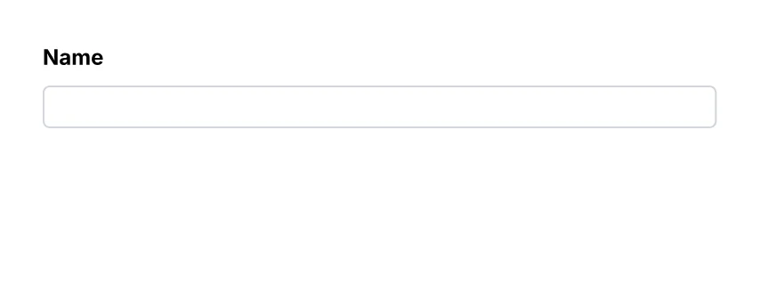
The same as TextField.
import { Document, Page, Text, TextInput, View } from '@inkoxide/render';

export default function Example() {
  return (
    <Document>
      <Page size={[320, 120]} className="p-6 text-xs">
        <View className="gap-2">
          <Text className="font-bold">Name</Text>
          <TextInput name="name" className="h-6 w-full rounded border border-gray-300 px-1" />
        </View>
      </Page>
    </Document>
  );
}
Checkbox
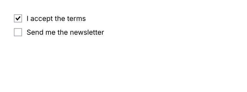
A checkbox.
import { Checkbox, Document, Page, Text, View } from '@inkoxide/render';

export default function Example() {
  return (
    <Document>
      <Page size={[320, 120]} className="p-6 text-xs">
        <View className="gap-2">
          <View className="flex-row items-center gap-2">
            <Checkbox name="terms" checked className="h-3.5 w-3.5 border border-gray-400" />
            <Text>I accept the terms</Text>
          </View>
          <View className="flex-row items-center gap-2">
            <Checkbox name="news" className="h-3.5 w-3.5 border border-gray-400" />
            <Text>Send me the newsletter</Text>
          </View>
        </View>
      </Page>
    </Document>
  );
}
| Prop | Type | Description |
|---|---|---|
checked | boolean | |
name (required) | string | Field name, unique in the document (radio buttons of one group share it). A <FieldSet> puts its name in front; dots make groups the same way (address.street). |
readOnly | boolean | |
required | boolean |
It also takes the shared props break, wrap, minPresenceAhead, pages, className, style, id, debug.
Radio
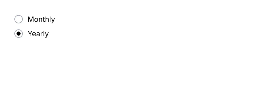
One button of a radio group (buttons share name).
import { Document, Page, Radio, Text, View } from '@inkoxide/render';

export default function Example() {
  return (
    <Document>
      <Page size={[320, 120]} className="p-6 text-xs">
        <View className="gap-2">
          <View className="flex-row items-center gap-2">
            <Radio name="billing" value="monthly" className="h-3.5 w-3.5 rounded-full border border-gray-400" />
            <Text>Monthly</Text>
          </View>
          <View className="flex-row items-center gap-2">
            <Radio name="billing" value="yearly" checked className="h-3.5 w-3.5 rounded-full border border-gray-400" />
            <Text>Yearly</Text>
          </View>
        </View>
      </Page>
    </Document>
  );
}
| Prop | Type | Description |
|---|---|---|
value (required) | string | The value the group exports when this button is selected. |
checked | boolean | Initially selected; at most one button of a group. |
name (required) | string | Field name, unique in the document (radio buttons of one group share it). A <FieldSet> puts its name in front; dots make groups the same way (address.street). |
readOnly | boolean | |
required | boolean |
It also takes the shared props break, wrap, minPresenceAhead, pages, className, style, id, debug.
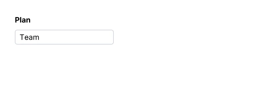
Select
A drop-down list.
import { Document, Page, Select, Text, View } from '@inkoxide/render';

export default function Example() {
  return (
    <Document>
      <Page size={[320, 120]} className="p-6 text-xs">
        <View className="gap-2">
          <Text className="font-bold">Plan</Text>
          <Select name="plan" options={['Starter', 'Team', 'Enterprise']} value="Team" className="h-6 w-40 rounded border border-gray-300 px-1" />
        </View>
      </Page>
    </Document>
  );
}
| Prop | Type | Description |
|---|---|---|
name (required) | string | Field name, unique in the document (radio buttons of one group share it). A <FieldSet> puts its name in front; dots make groups the same way (address.street). |
readOnly | boolean | |
required | boolean | |
options | string[] | |
select | never | |
value | string | The selected option. |
It also takes the shared props break, wrap, minPresenceAhead, pages, className, style, id, debug.
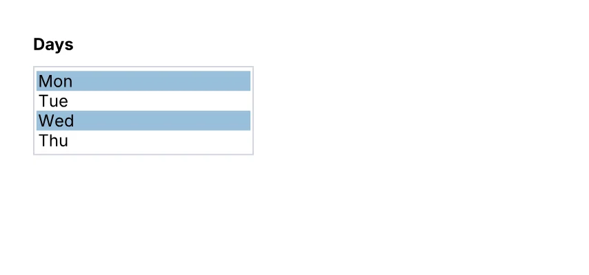
List
A list box: several options in view (four without a height), one or several selected.
import { Document, List, Page, Text, View } from '@inkoxide/render';

export default function Example() {
  return (
    <Document>
      <Page size={[320, 150]} className="p-6 text-xs">
        <View className="gap-2">
          <Text className="font-bold">Days</Text>
          <List name="days" options={['Mon', 'Tue', 'Wed', 'Thu', 'Fri']} multiSelect value={['Mon', 'Wed']} className="w-40 border border-gray-300" />
        </View>
      </Page>
    </Document>
  );
}
| Prop | Type | Description |
|---|---|---|
name (required) | string | Field name, unique in the document (radio buttons of one group share it). A <FieldSet> puts its name in front; dots make groups the same way (address.street). |
readOnly | boolean | |
required | boolean | |
options | string[] | |
select | never | |
multiSelect | false | |
value | string | The selected option. |
It also takes the shared props break, wrap, minPresenceAhead, pages, className, style, id, debug.
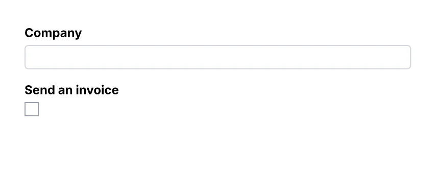
Field
An interactive form field (AcroForm).
import { Document, Field, Page, Text, View } from '@inkoxide/render';

// A form built from data: each question picks its field by `kind`.
const questions = [
  { kind: 'text', name: 'company', label: 'Company' },
  { kind: 'checkbox', name: 'invoice', label: 'Send an invoice' },
] as const;

export default function Example() {
  return (
    <Document>
      <Page size={[320, 130]} className="p-6 text-xs">
        <View className="gap-3">
          {questions.map((q) => (
            <View key={q.name} className="gap-1">
              <Text className="font-bold">{q.label}</Text>
              {q.kind === 'text' ? (
                <Field kind="text" name={q.name} className="h-6 w-full rounded border border-gray-300 px-1" />
              ) : (
                <Field kind="checkbox" name={q.name} className="h-3.5 w-3.5 border border-gray-400" />
              )}
            </View>
          ))}
        </View>
      </Page>
    </Document>
  );
}
| Prop | Type | Description |
|---|---|---|
kind (required) | 'text' | 'checkbox' | 'radio' | 'select' | 'list' | Which field: the other props are those of TextField, Checkbox, Radio, Select or List. |
FieldSet
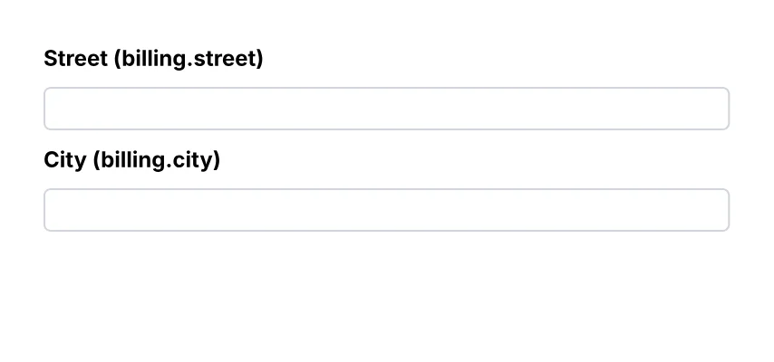
A group of form fields: a View whose name goes in front of the name of every field inside it, at any depth (<FieldSet name="address"><TextField name="street" /></FieldSet> is the field address.street). Sets nest: a.b.c.
import { Document, FieldSet, Page, Text, TextField, View } from '@inkoxide/render';

export default function Example() {
  return (
    <Document>
      <Page size={[320, 150]} className="p-6 text-xs">
        <View className="gap-2">
          <FieldSet name="billing" className="gap-2">
            <Text className="font-bold">Street (billing.street)</Text>
            <TextField name="street" className="h-6 w-full rounded border border-gray-300 px-1" />
            <Text className="font-bold">City (billing.city)</Text>
            <TextField name="city" className="h-6 w-full rounded border border-gray-300 px-1" />
          </FieldSet>
        </View>
      </Page>
    </Document>
  );
}
| Prop | Type | Description |
|---|---|---|
name (required) | string | The group's name, put in front of the name of every field inside it: address.street. |
render | RenderProp |
It also takes the shared props break, wrap, minPresenceAhead, fixed, pages, href, bookmark, className, style, id, debug.
Synced from components/forms.md in the inkoxide repository.